As the number of cases and deaths due to COVID-19 ramp up in Pakistan, let’s take a look at how… Read More
The post Pakistan’s Fight Against Coronavirus Explained in Graphs appeared first on .
As the number of cases and deaths due to COVID-19 ramp up in Pakistan, let’s take a look at how our numbers and their trajectories to ascertain just how effective our response has been.
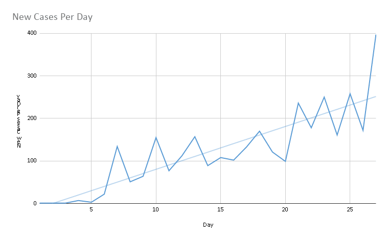
New Cases Per Day (Graph 1)

- Graph 1 shows that our trendline is positive, and the number of new cases are likely to grow in the coming days.
- Graph 1 also shows that we still going uphill into the outbreak and still haven’t hit our peak
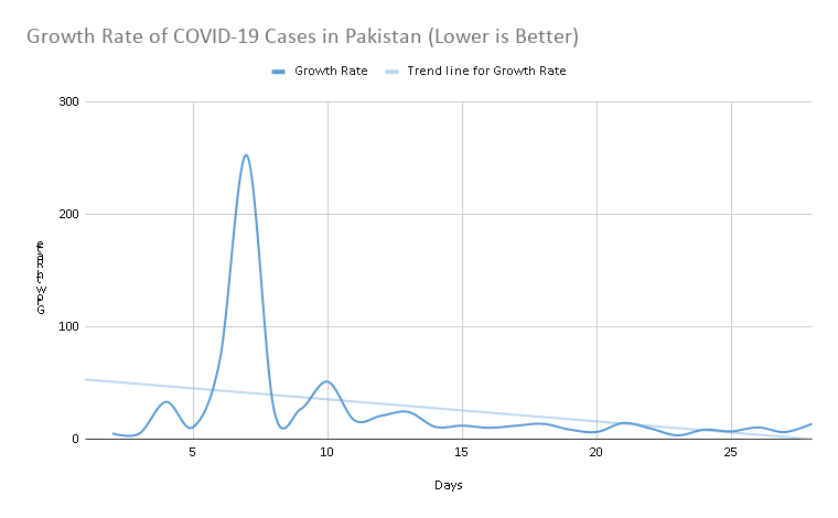
Growth Rate of COVID-19 Cases (Graph 2)

- The growth rate has been steady over the past two weeks after a spike in first week.
- Spike in the first week was due to Taftaan cases which inflated the numbers
- The growth rate has been under 20% for the last two weeks, and under 10% over the past seven days
- The growth rate isn’t going to decline until Pakistan hits its peak
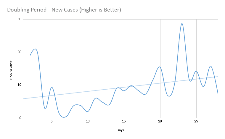
Doubling Period for New Coronavirus Cases (Graph 3)

- Doubling down rate (in days) is increasing, which is a positive sign. Currently, the doubling rate is around 10 days.
- Higher doubling rate shows social distancing measures in place are working.
- For perspective, there are cities in the world where the doubling rate is 3 days, or even less.
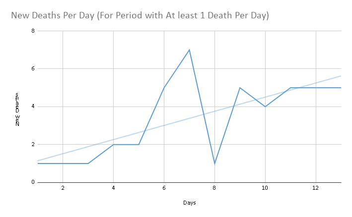
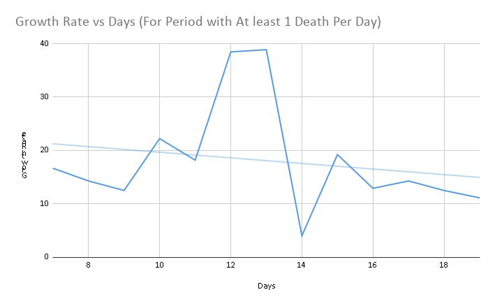
New Deaths Per Day (Graph 4)

- New death per day are increasing, this reflects the growth in positive cases (from graph 1) that were tested two weeks ago.
Growth Rate for Deaths (Graph 5)

- Growth in death rate is on the decline, which is great
- This death rate is currently around 12%, down from as high as 40% a week ago.
- We can expect the death rate to increase, as the snowball effect of outbreak will unfold.
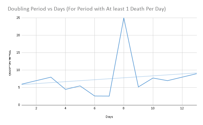
Doubling Period for Deaths (Graph 6)

- Doubling period of death rate is increasing, which is very positive
- This shows that lock-downs are working and there’s some progress towards containment of outbreak
Pakistan’s numbers are far better than what we saw in developed countries like Italy, the US, Spain, France, and others at this stage of the crisis. Part of the reason is the government’s decision to lockdown before the numbers had begun to snowball.
However, the number of new cases will rise as Pakistan’s testing capacity ramps up. While we’ve done well so far, we must not be complacent as Pakistan’s margin for error is very low because of limited healthcare facilities. If we see the same situation as in Italy, for instance, the potential for disaster is magnitudes worse.
Managing the situation over the next few weeks is going to be critical to make sure Pakistan comes out of the COVID-19 crisis successfully.
The post Pakistan’s Fight Against Coronavirus Explained in Graphs appeared first on .

