YouTube has been experimenting with its comment section for a while. The newest experiment has relocated the comment section right… Read More
The post YouTube Tries Out a New, Better Comment Layout appeared first on .
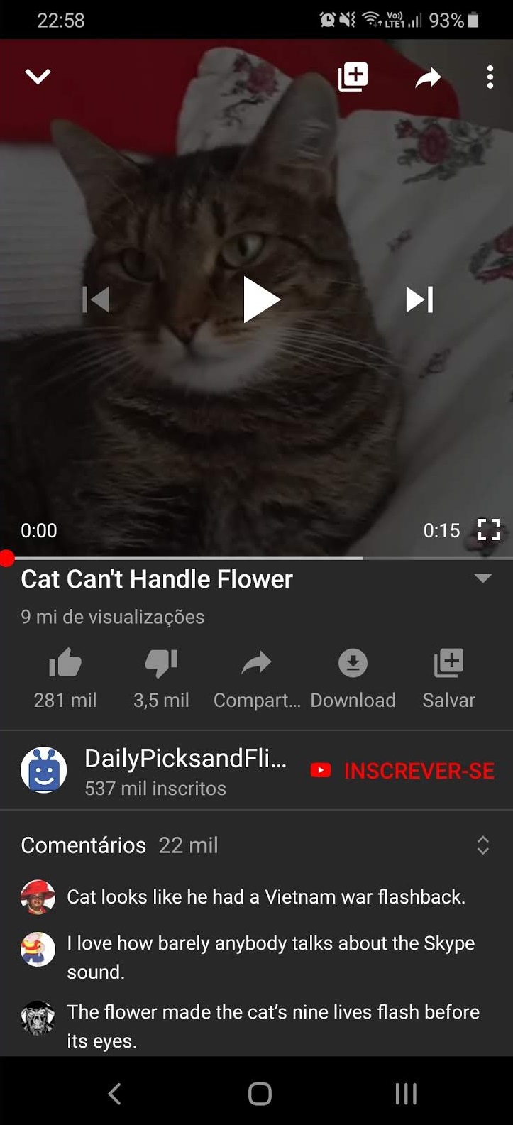
YouTube has been experimenting with its comment section for a while. The newest experiment has relocated the comment section right next to the video description and only the top three comments will be visible.
This is what it looks like, courtesy of DigitalInformationWorld:

In order to view the whole comment section, users will have to click on it. Apart from this, the comment box will be visible while watching the video. Hence, users will be able to drop comments in between the video as well. In the current layout, users have to scroll down to the bottom of the page to see the comments.
As the feature rolls out, the creator of the video will be able to pin a comment so it appears with the top three comments under the description. Apart from this, comments with links and more than 140 characters will not show up in the top 3 comments.
In a recent blog post, Google said,
We want to make it easier for people watching videos to find comments in the YouTube app without having to scroll through “Up Next” videos, so we’re testing out a new comment section that appears directly below the video. The new section will show up to three comments, with an option to view all comments while you continue to watch the video – just like you can today.
Before this, Google experimented with hiding the comments altogether. You could only see the comments by scrolling down the pressing the button to open up the comment section. This idea failed since users consider comments as an integral part of the viewing experience and were not very happy with the change.
The post YouTube Tries Out a New, Better Comment Layout appeared first on .
06/11/2019 01:22 PM
06/11/2019 06:17 AM
06/11/2019 06:40 AM
06/11/2019 06:03 AM
06/11/2019 12:59 PM
06/11/2019 12:56 PM
06/11/2019 06:08 AM
06/11/2019 12:54 PM
2014 © Pakistani apps and news